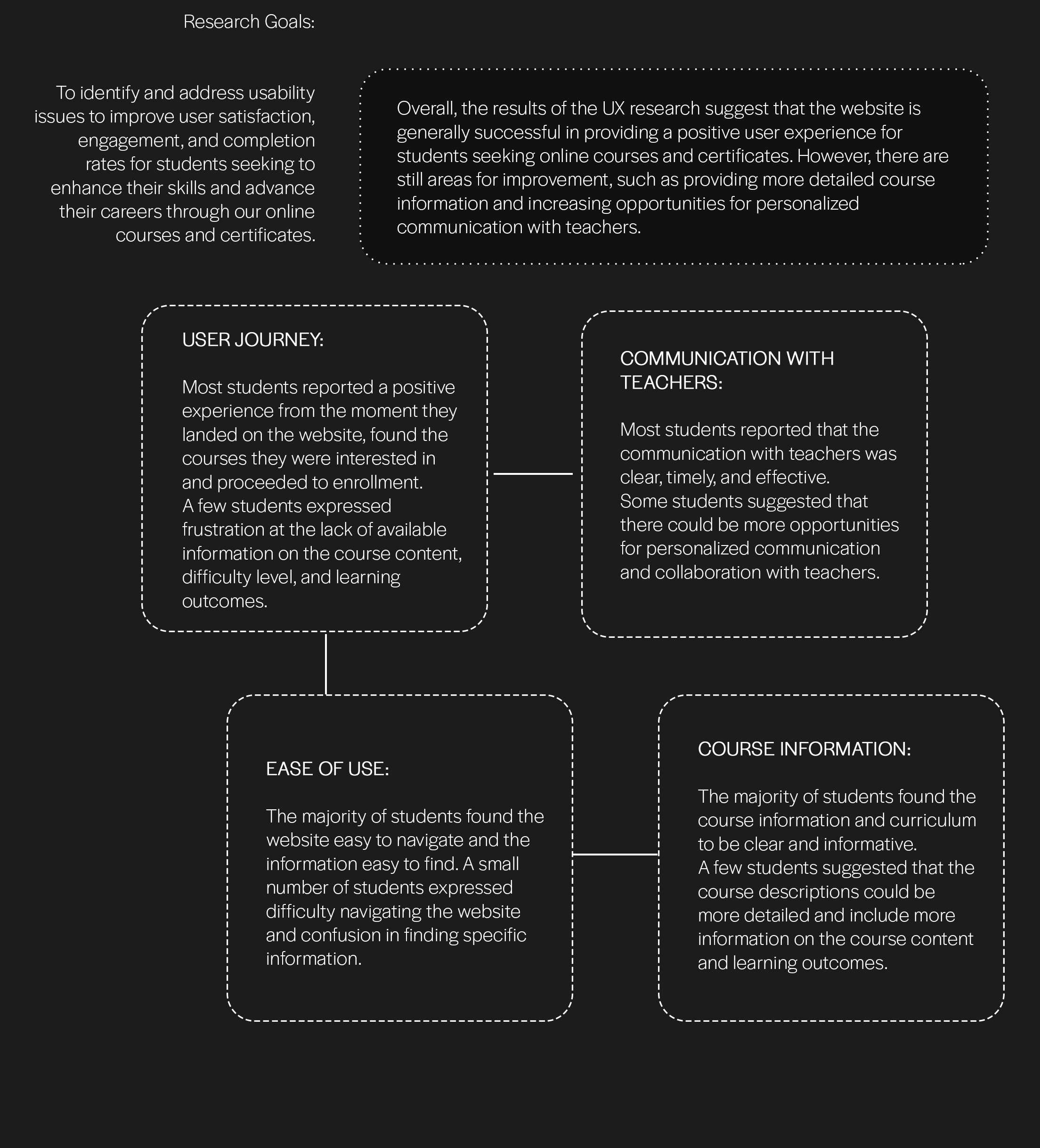
Most students reported a positive experience from the moment they landed on the website, found the courses they were interested in and proceeded to enrollment. A few students expressed frustration at the lack of available information on the course content, difficulty level, and learning outcomes.
User Research: Conducted surveys and interviews to understand pain points.
Journey Mapping: Visualized the student journey to identify improvements.
Wireframing: Created low-fidelity wireframes for initial layout.
Prototyping: Developed high-fidelity prototypes using Figma.
User Testing: Gathered feedback through usability testing.
Iteration: Made iterative improvements based on feedback.
Final Design: Finalized design for implementation.
The majority of students found the website easy to navigate and the information easy to find. A small number of students expressed difficulty navigating the website and confusion in finding specific information.
Most students reported that the communication with teachers was clear, timely, and effective. Some students suggested that there could be more opportunities for personalized communication and collaboration with teachers.
The majority of students found the course information and curriculum to be clear and informative. A few students suggested that the course descriptions could be more detailed and include more information on the course content and learning outcomes.
Overall, the results of the UX research suggest that the website is generally successful in providing a positive user experience for students seeking online courses and certificates. However, there are still areas for improvement, such as providing more detailed course information and increasing opportunities for personalized communication with teachers.
Full Screenshots Below